

Myconian Collection presents its new visual identity, a natural evolution that connects the past with the future and expresses, with greater clarity, its philosophy.
This is not a change of direction, but a mature renewal of its image and language, which captures authenticity, discreet luxury and a sense of intimacy.
The new identity does not seek to impress, but to express what has always been at the core of the group’s hospitality: warmth, truth and a personal connection with the place. Inspired by Mykonos and four decades of family history, the creative approach was based on a simple idea: to keep what is essential and to leave what is not.
The result is a design that is clean, calm and confident — a modern depiction of hospitality as the family experiences it every day.
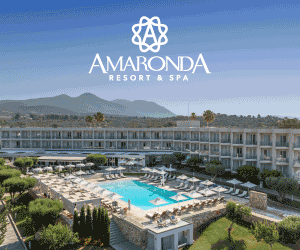
Each of the fourteen hotels in the collection now has a logo and a typographic identity designed with the aim of harmony and consistency, without losing the personality of each hotel. The clean lines, balanced proportions and a sense of tranquility exude the elegance of Cycladic architecture, not through imitation, but through its very spirit.
The logos were created to work on every material and surface — from signboard and paper, to fabric and screen — and above all to withstand time, because they were designed with timelessness in mind, not trend.
The palette — a language of light and life
The color palette exudes atmosphere. It draws inspiration from the light and materials of the place, from the white of the whitewashed wall and the blue of the Aegean, to the earthy tones of the stone, the green of the olive tree and the golden light of the sunset. It is not only about the landscape, but also captures the life within it: the table and the veranda, the shade of the courtyard, the candlelight, the sea breeze and the relaxed conversation that continues until late at night.
The team drew inspiration from the family archive and the contemporary experience of the guests, seeking the perfect balance between serenity and contrast; a result that is clean, functional and aesthetically elegant, both in the printed and digital environment.
The websites — the experience begins before arrival
In the digital environment, the entire experience was redesigned from the ground up. Navigation is simple and natural, the pages are clean and bright, the content is essential. Images have room to breathe, texts take on a role and meaning. Each hotel has its own “voice” within a unified system, allowing the guest to move easily from inspiration to decision — from thinking about Mykonos to booking, without friction. The goal was not to impress, but to welcome: to make the guest feel like they are already there.
Continuity, not fashion
“This renewal expresses who we are and how we continue to evolve,” says Anastasios Naum, Commercial Director of Myconian Collection. “We wanted an identity that respects our place and our people, and that remains as true and contemporary in the future as it is today.”
The new identity brings back something essential: that luxury is not a list of amenities, but a way of welcoming people.

